BRONCO
LIGHT
01
CONCEPT & VISION
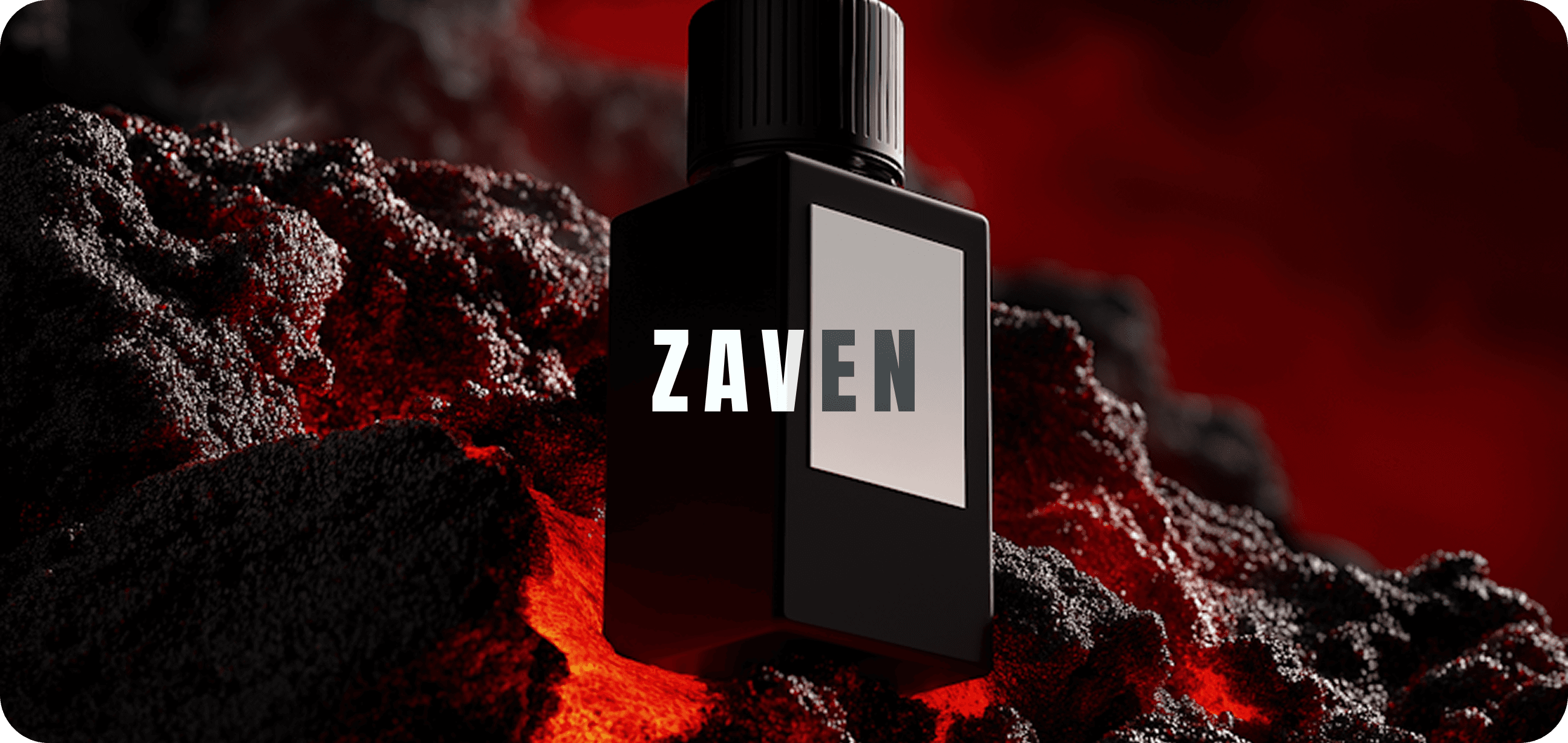
Bronco Light was envisioned as a design system that power through minimalism. The concept blends the energy of light with the grounded nature of strength — a balance between force & clarity. Every visual element was designed to feel bold yet breathable confident yet calm.
AERO CORP
Client
VISUAL DESIGN
Service
MAR 2025 - APR 2025
Timeline


02
DESIGN PROCESS
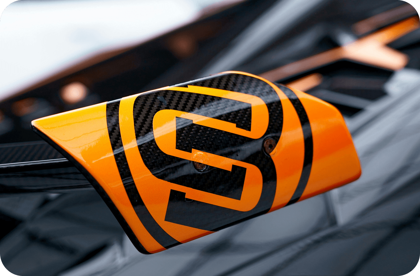
The process started with multiple mood board explorations focused on tone, light, and narrative. We tested various compositions to study how shapes could user perception. Through iterative sketching, we identified a visual hierarchy that emphasized clarity and motion. Typography was chosen to be assertive yet elegant, allowing it to anchor every layout. We experimented with grid systems to ensure flow between elements.
The color palette leaned into muted shade paired with one striking — symbolizing edge and focus. Our design process valued adaptability; assets were created to seamlessly scale between campaigns, posters, and digital touchpoints.
03
OUTCOME & IMPACT
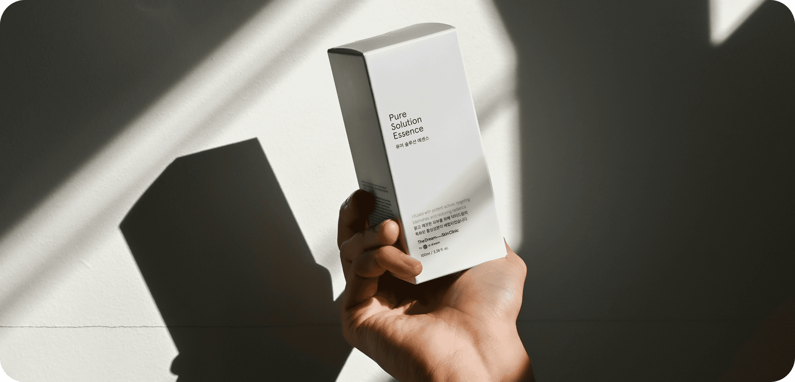
The color palette draws from metallic warmth and cool neutrals, mirroring light cutting through shadow. Typography complements this balance with modern, sturdy forms and subtle elegance. Together, they create a visual rhythm that feels structured and luminous The layout focuses on open space, letting every detail glow without clutter.
SITE OF THE DAY
2024
(CSS)
BEST US PORTFOLIO
2025
(Awwwards)

Apexus Collective