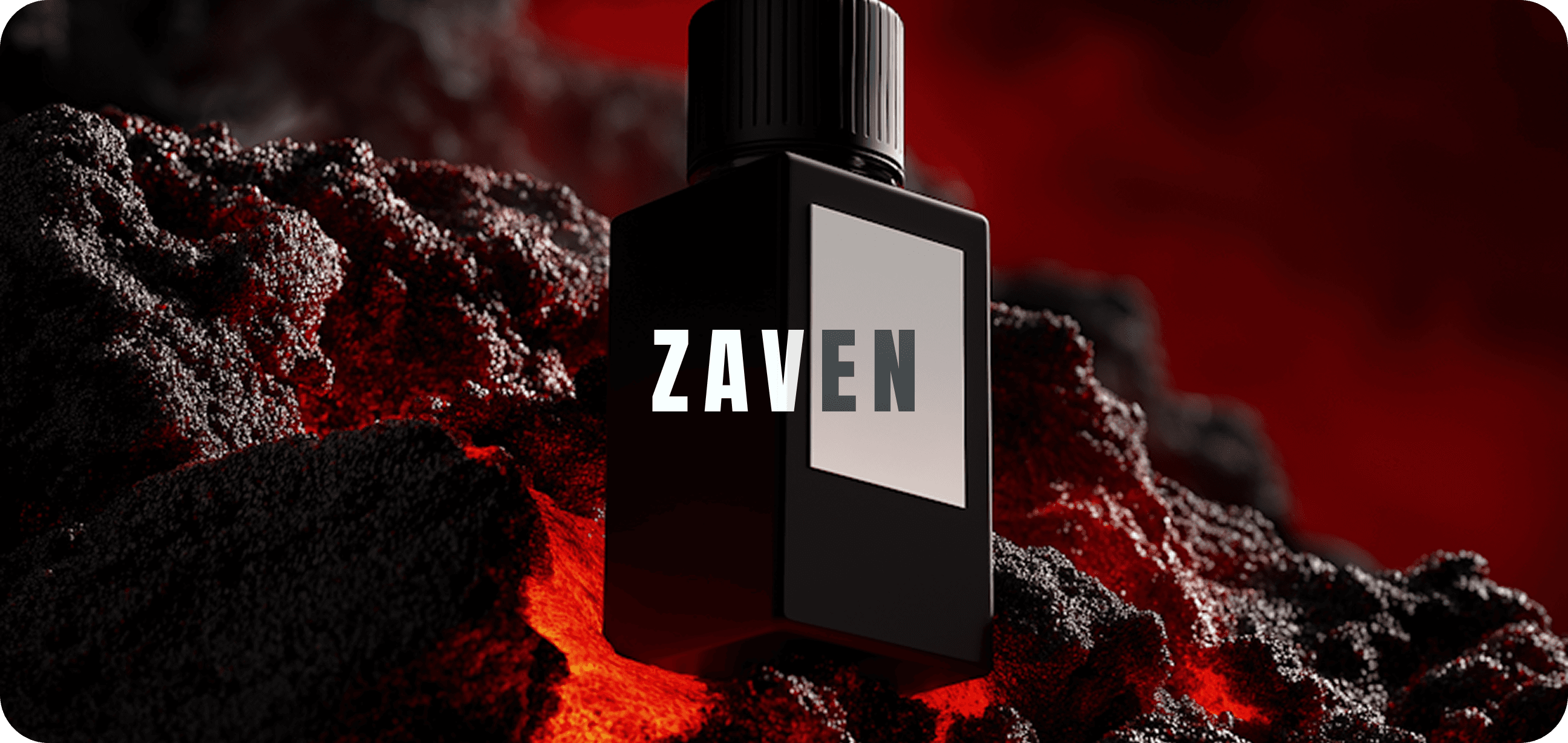
ZAVEN
FORGE
01
CONCEPT & VISION
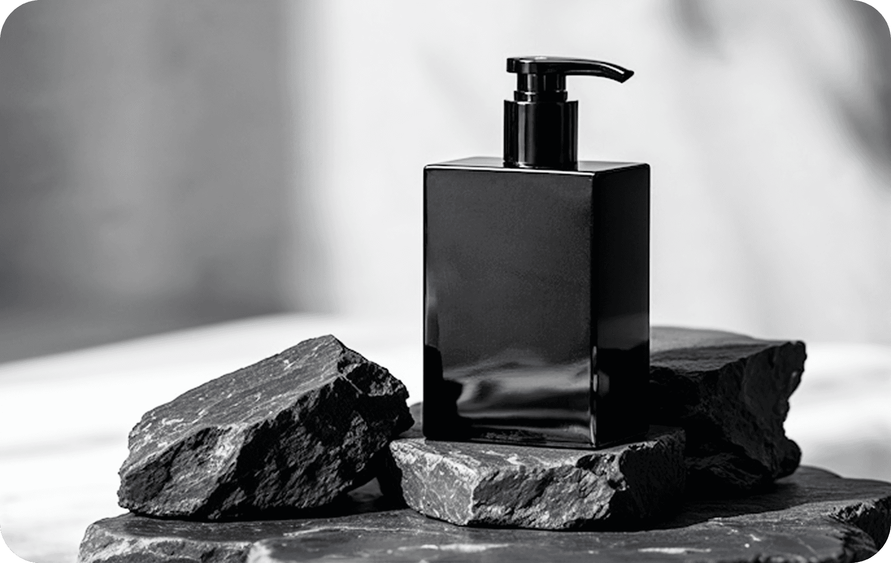
Zaven Forge was designed to embody the art of creation — where strength meets. The brand’s core idea comes from the forge itself: a place where raw material transforms under precision and intent. Every visual element reflect that spirit of craftsmanship and control.
QUANTUM HIVE
Client
BRANDING
Service
MAR 2025 - APR 2025
Timeline

02
DESIGN PROCESS
Sharp angles and sturdy line express durability, while refined spacing add sophistication. The color palette revolves around steel, ember, and charcoal — tones that feel grounded and bold. Typography reinforces strength through structure and balance, echoing the idea of something built to last. At the heart of Zaven Forge lies the philosophy of the intentional creation.
Every line, shadow, and spacing was treated like metal under heat shaped with patience and precision. The brand language mirrors craftsmanship through textures, gradients and structured geometry.
03
OUTCOME & IMPACT
Boldness was balanced with restraint, allowing the brand to feel powerful yet composed. The logo variations were designed to adapt seamlessly across scale, from print to digital Typography pairs heavy fonts with subtle contrasts.
SITE OF THE DAY
2024
(CSS)
BEST US PORTFOLIO
2025
(Awwwards)

Apexus Collective