PURE
REALM
01
CONCEPT & VISION
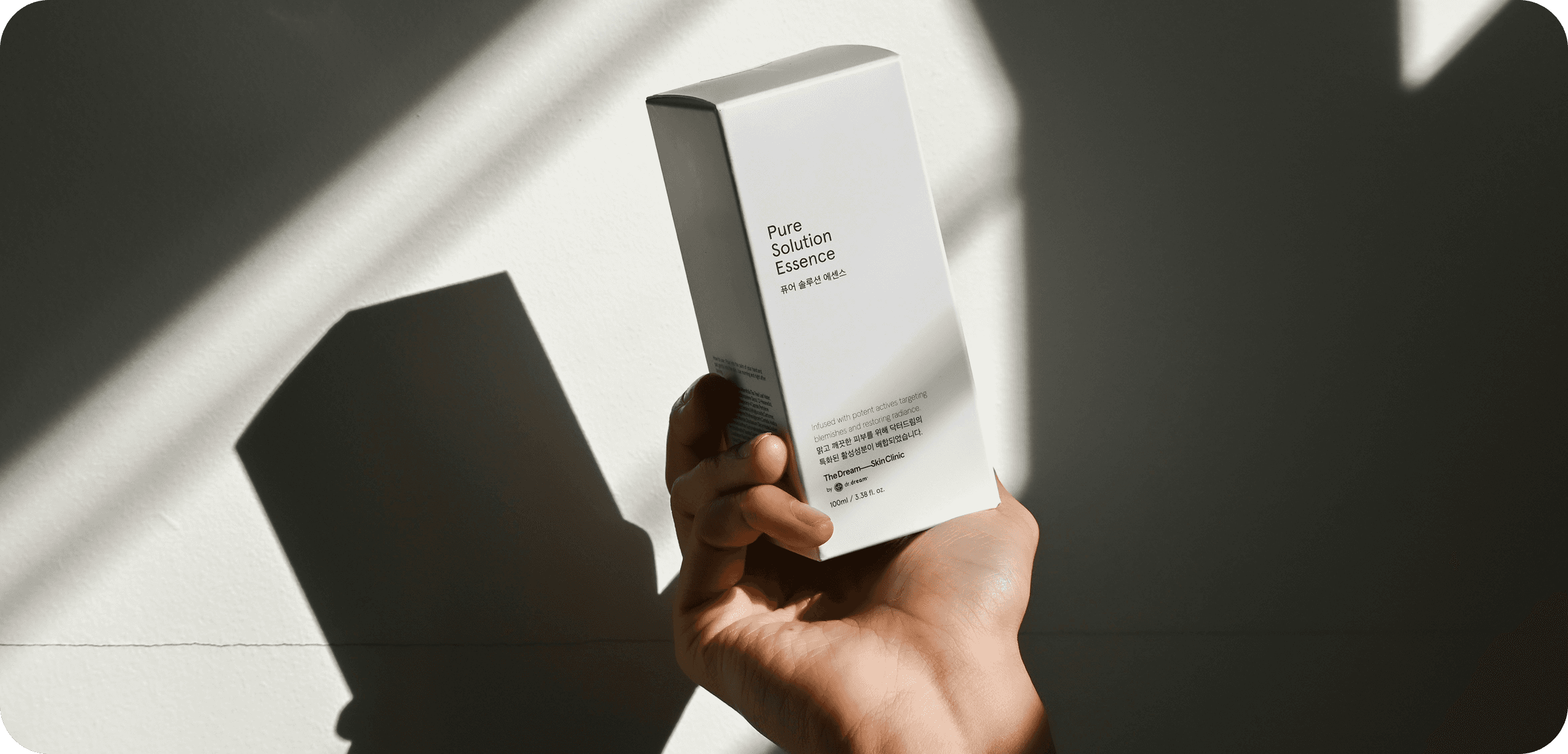
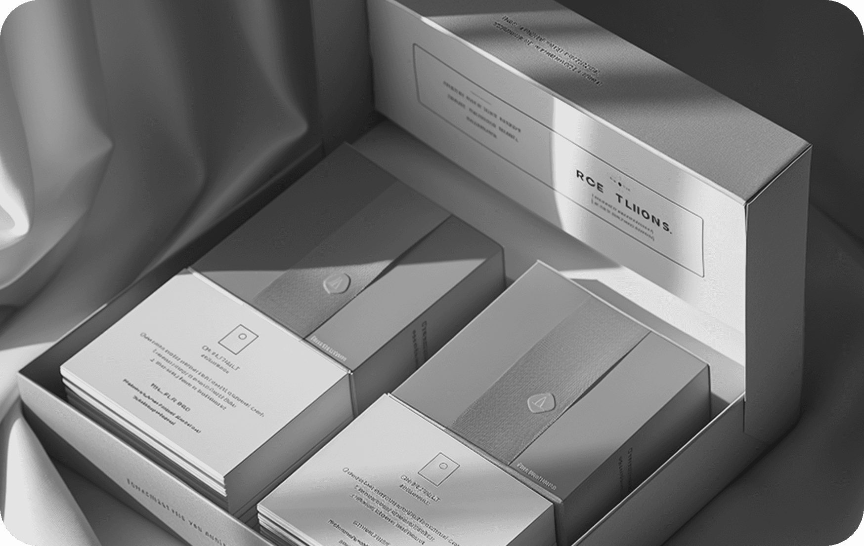
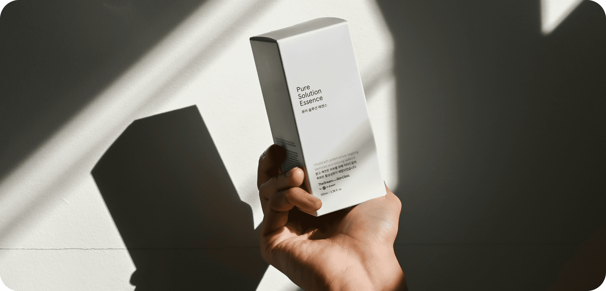
Pure Realm was crafted to represent balance, serenity, and clarity through design. The visual approach focused on removing excess and letting purpose guide every decision. The brand’s aesthetic lives in clean geometry, soft gradients, and subtle tonal contrasts Whites, neutrals, and muted hues formed the core palette.
QUANTUM HIVE
Client
VISUAL DESIGN
Service
MAR 2025 - APR 2025
Timeline
02
DESIGN PROCESS
The typography chosen reflects quiet confidence, balancing minimalism sophistication. Icons and visuals follow a symmetrical, organized rhythm that mirrors purity in form. Nothing feels forced; every element exists for a reason. This design direction transforms simplicity into emotion — calm that communicates clarity. The result is a visual identity that feels transparent, genuine, and complete.
The concept of Pure Realm revolves around the modern need for calm design in a visually noisy world. Every creative decision was driven by a pursuit of harmony and flow. Shapes and lines were softened to evoke comfort and ease.
03
OUTCOME & IMPACT
The visual hierarchy guides attention naturally, without distraction or pressure. Light play a quiet role here — diffused, balanced, and intentional. The overall tone of the design reflects emotional stillness blended with digital precision. Gradient transition seamlessly reflecting purity as a continuous state, not a static one.
SITE OF THE DAY
2024
(CSS)
BEST US PORTFOLIO
2025
(Awwwards)

