LUMEN
DRIFT
01
CONCEPT & VISION
Lumen Drift was born from the idea of light in motion fluid, adaptive, and ever-evolving. The brand identity translate illumination into a visual language of movement and depth The goal was to design an identity that feels alive, guiding perception through glow and gradient. Each element reflects how light transforms space — subtle yet powerful.
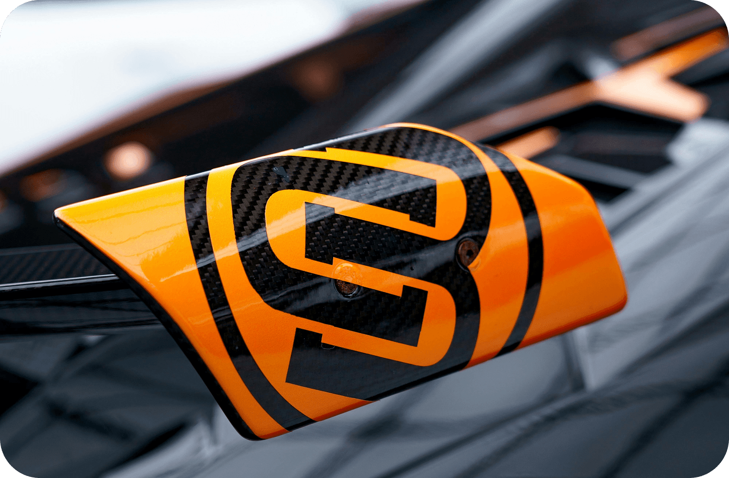
STRATO CORE
Client
UI/UX DESIGN
Service
MAR 2025 - APR 2025
Timeline


02
DESIGN PROCESS
The logo is built around smooth curvature and directional, symbolizing motion without chaos. Colors shift gently between luminous tones, evoking calm energy and innovation. The typography complements this flow — clean, modern, and lightly futuristic. Every detail was crafted to echo radiance and rhythm. The brand lives where clarity meets motion — a visual balance of brightness and drift.
The essence of Lumen Drift lies in creating a dynamic yet refined brand tone. Each visual and verbal cue was shaped around the idea of drift — movement with direction, fluid yet controlled. The design system adapts across mediums with effortless continuity.
03
OUTCOME & IMPACT
The final outcome of Lumen Drift’s branding celebrates radiance as design philosophy. It captures emotion through light and energy through minimalism. Every brand touchpoint feels illuminated — soft glows, calm contrast, and balanced warmth. Photography and art direction emphasize reflective textures and ambient tone.
SITE OF THE DAY
2024
(CSS)
BEST US PORTFOLIO
2025
(Awwwards)

Apexus Collective