DESIGN
AXIS
01
CONCEPT & VISION
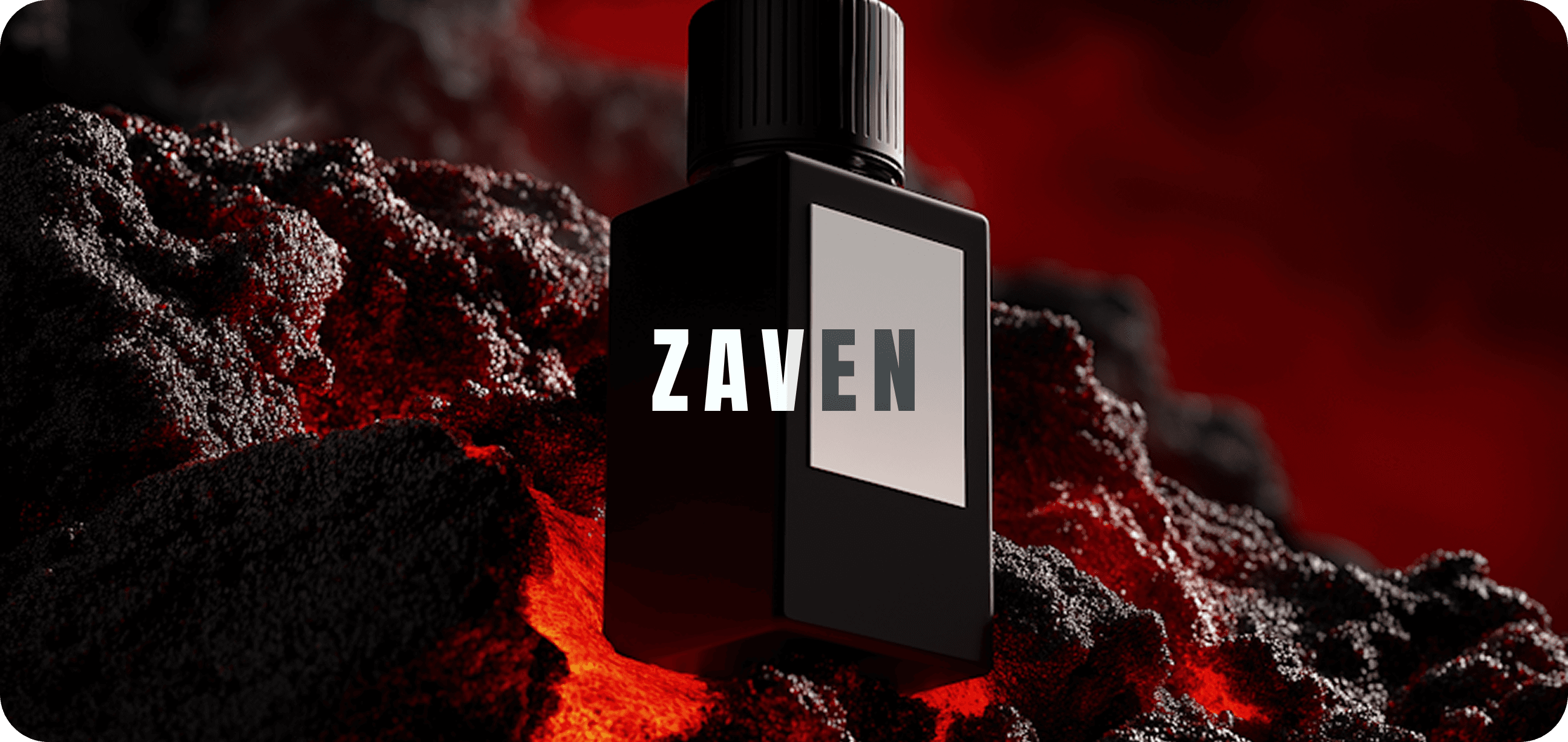
"Creative Edge" began as a visual exploration of how minimal designs still carry powerful impact. The goal was to redefine the boundaries of flat design by integrating depth, and contrast without losing clarity. We aimed to give the brand a voice that felt both sharp and approachable — a harmony between bold structure and refined detail.
DESIGN SYNTAX
Client
BRANDING
Service
MAR 2025 - APR 2025
Timeline


02
DESIGN PROCESS
The process started with multiple mood board explorations focused on tone, light, and narrative. We tested various compositions to study how shapes could user perception. Through iterative sketching, we identified a visual hierarchy that emphasized clarity and motion. Typography was chosen to be assertive yet elegant, allowing it to anchor every layout. We experimented with grid systems to ensure flow between elements.
The color palette leaned into muted shade paired with one striking — symbolizing edge and focus. Our design process valued adaptability; assets were created to seamlessly scale between campaigns, posters, and digital touchpoints.
03
OUTCOME & IMPACT
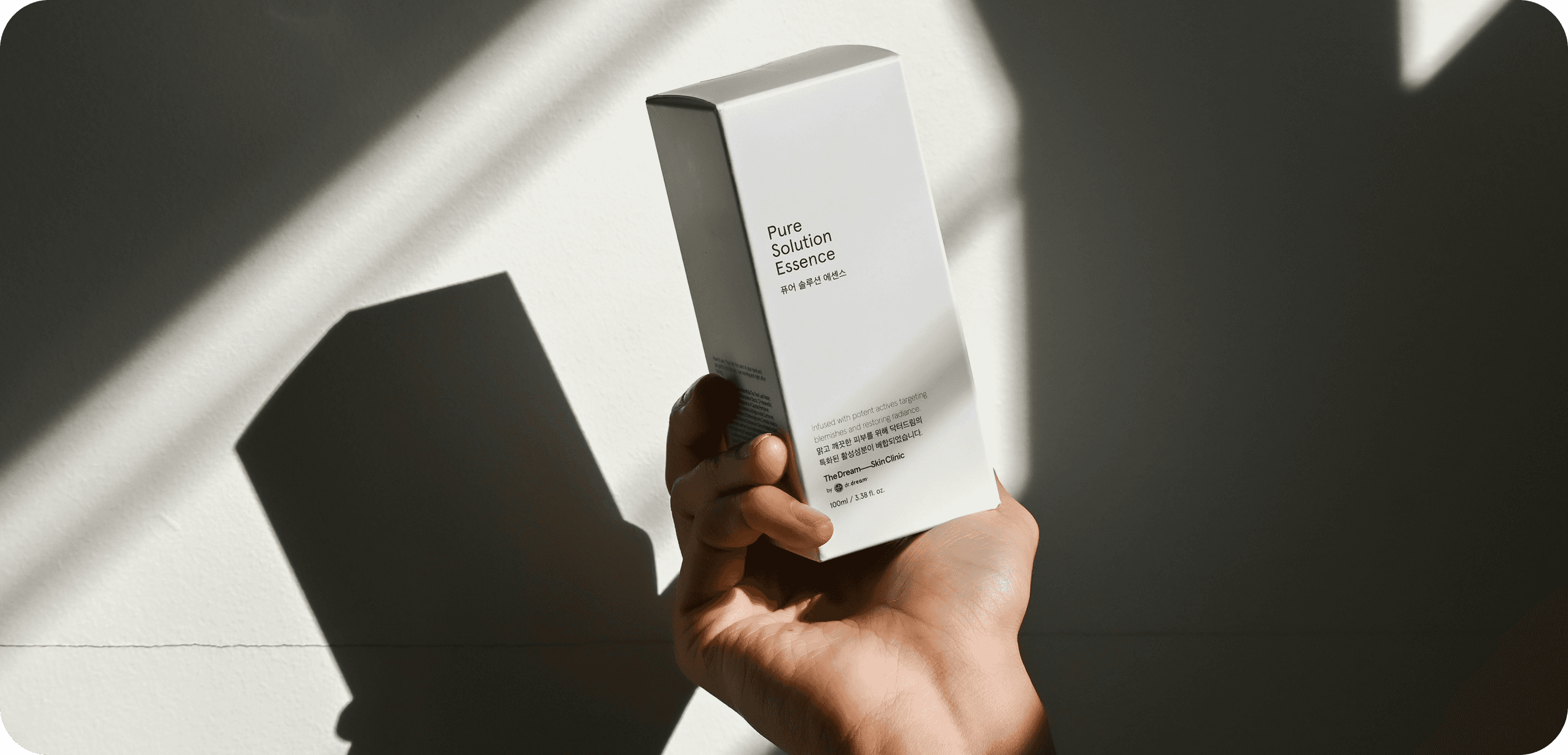
The final outcome of “Creative Edge” was a cohesive visual system that elevated client’s identity to a new level of sophistication. The branding captured through its simplicity, making the audience pause and engage. Every piece — from poster to brand stationery echoed the same voice of confidence and innovation.
SITE OF THE DAY
2024
(CSS)
BEST US PORTFOLIO
2025
(Awwwards)

Apexus Collective